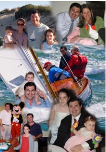
 I thought I’d take a break from my “Balance” series to introduce you to one more facet of my creative life in the hope that it might inspire you. I created above photomontage to celebrate the adoption of my friend Susan’s oldest daughter from China. Photomontages make wonderful gifts and are a creative way to honor a person or event. I started making photomontages for friends and family to celebrate milestone birthdays, weddings and Bar Mitzvah’s. The finished product, when printed on the right paper is suitable for framing.
1. The first thing you’ll need are some photographs. 5-15 images are good to start with. Adding pictures of documents such as birth announcements or wedding invitations or other tokens that have meaning to the recipient can add some interest to your montage. You’ll also need Adobe PhotoShop.
2. If your photos are not digital (those great old photos from childhood rarely are) scan them at a high resolution (at least 300dpi) at the size that you think you’ll want to use them, or larger. This is so that when re-sizing images to fit in a layout you won’t end up with pixelated images.
3. Decide what size you want your final printed piece to be. This is important since once you have finished your project you’ll want to reproduce it without losing quality. For printing on an ink-jet printer you’ll need at least 150dpi at the size that you want it. If you designed your piece to be 8-1/5 x 11 at 300dpi, the effective resolution of a blow-up of 17 x 22 would be 150dpi.
4. Set up your photoshop document to the size and resolution that you want with a transparent background.
Look at your photos and decide upon a rough layout. Is there one photo that calls out to be the centerpiece? If it’s for an anniversary, maybe the couple’s wedding photo. This is a creative project so you decide what looks good. You can always change things if it doesn’t look right once you get going.
5. Open the images that you want to make a part of the montage and drag a couple onto the new document. Make sure that the image resolution is the same for both the images and the new document or your images are going to re-size according to the document’s resolution. This is ok if your images are larger than the new document (you can then just re-size them down if you need to) BUT you don’t want to re-size images up.
6. You’ll see that each image that you dragged over is now on a separate layer. Roughly place various images next to and overlapping each other to form an attractive layout. Pay attention to backgrounds that might blend well together when choosing which photos to place next to which.
7. The key to creating photomontages is layer masks. Using layer masks will allow you to make non-destructive changes to your images which can be easily undone if you need to change them later. I learned this after using the eraser tool and later discovering that I couldn’t put something back that I had erased a few saves ago!
Select your layer and select Layer > Layer Mask > Reveal All. (Make sure that the layer mask is highlighted when making your edits.)
Using the brush tool, and making sure that the black is in the foreground of the tool palette, you can now erase away parts of the images that you want to hide so that and parts of the image in the layer below that was hidden is now viewable. If you make a mistake, switch to the white foreground and you can paint your image back in. Play with the size of the brush and it’s opacity for more creative options. I tend to use a fairly soft brush to avoid any hard edges.
8. SAVE OFTEN! You don’t want to spend hours on your masterpiece only to lose all your work if you computer suddenly decides to freeze (it happens, I know from experience).
9. When you are satisfied with your montage save your layered photoshop file for future reference. Then flatten your layers and SAVE AS a jpg or tiff file for printing.

50th Birthday digital photo montage for a sailor and a dad
10. Then print on your ink jet printer. I recommend using Epson Enhanced Matte Photo paper. Also, to be sure that your image looks as good on paper as it does on screen, make sure to adjust the settings for your printer in the print dialog box. Set the paper type based upon which paper you’ve chosen and ask PhotoShop to manage color. All you need now is a frame!
If this all sounds greek to you and you have an upcoming event or occasion that you like some help creating a custom photomontage for feel free to call on me. Click here for more info and to see more of my photomontage work.
 Anyone who knows me, knows that the ocean is my second home (or would be if I already owned my dream home). From the time my father taught me to swim as a little girl, I have always felt comfortable in and around the water. Whether I’m sitting on the beach watching the ocean’s waves roll in and out or immersed in it, not only do I feel at peace, but I feel a connection to something special. When I scuba dive I am a visitor to another world — a world beneath the sea. There is an enormous amount of life under the ocean’s surface. Coral reefs are teaming with life, fish and animals both big and microscopic all living together in a fine balance. Each time I dive, I notice more damage to the reefs and less and less fish life. There are many organizations who dedicate themselves to protecting and preserving our ocean environments and educating divers, fisherman and the general population about ways they can help.
 I’m sitting here recuperating from bunion surgery (I had my right foot done last Thursday and am scheduled to have the left one done next Thursday) and trying to decide how to incorporate this latest state of being into a post about balancing life. Right now I feel pretty imbalanced –bot literally and metaphorically. I have this very attractive (not!) cane which I walk with to keep me from putting too much weight on my right foot. Definitely not in balance! But next week I’m due to have the other foot done so, eventually (in about 7 weeks) I will be back in balance – literally!