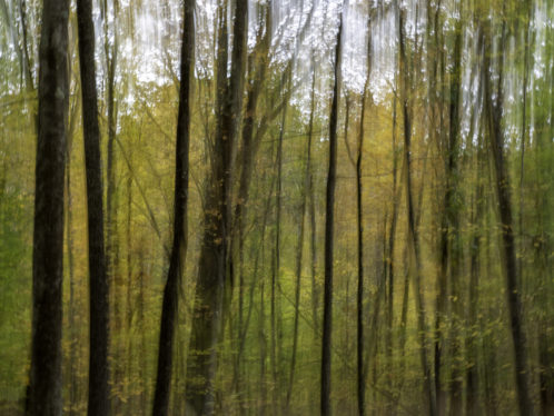
Change is Good…

No Gravatar
Photo: © Sheryl Checkman

Being a lover of warm weather the end of summer always feels a bit bittersweet. On one hand the lazy, sun-drenched days of beach visits and barbecues are past, but on the other hand, the crisp air and glorious colors of Autumn do offer a welcome consolation prize. Change is good.

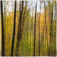
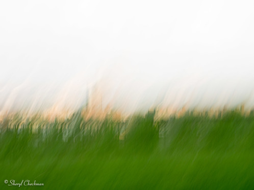
I find that the change in season gives me new subject matter to photograph and new ideas for product design. The photo above was taken on a visit to Narrowsburg, NY. Walking along a country road one morning I was struck by the beauty of the surrounding woods. Using a slow shutter speed I was able to capture the colors of the the changing leaves and the striking vertical lines of the tree trunks in this impressionistic image.

Autumn Woods Scarf available on lifeisbalance.etsy.com

I designed this sheer scarf (above) from this impressionistic fine art photograph.

A chic addition to any Autumn outfit! Wear this luxuriously soft scarf around your neck, as a wrap, or tie it around your waist as a beautiful sarong. Dimensions: 50 in x 50 in. You can find this scarf on my Etsy shop here.

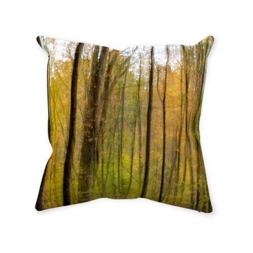
Autumn Woods Throw Pillow

This design is also available as a throw pillow or pillow cover in a variety of sizes.

Dreamscapes – Expressing my Creativity through Photography

No Gravatar

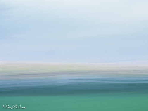
Riverscape abstract photo of the East River

Riverscape

I received  a new Olympus OM-D EM5 Mark II mirrorless camera for my birthday this year. Up until now, I’ve been using a Canon G11, higher end point and shoot camera. I liked that camera but felt limited creatively. My new Olympus however, is allowing me to tap into my creativity, while I am learning to use it! I am hoping to grow, not only as an artist and designer, but as a photographer as well.

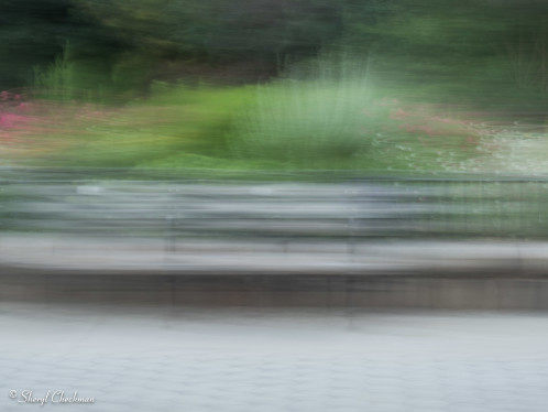
I’ve started a series of photographs that are impressionistic in nature. I am calling this series my dreamscapes, because they are  landscape photos with a very dream-like, painterly look. For the most part I am making these photos within the camera, only relying on the computer to enhance colors more to my liking and mood. The photo above, Riverscape, was taken looking at the East River in NYC from Carl Shurz Park on the Upper East Side. The photos below, Park Bench Dream and Park View were also taken from Carl Shurz Park, but the vantage points and subject matter produce much different photos.

This series is all about looking at things differently in order to create a unique work of art. The photos below are available for purchase at my Etsy Shop. You can click on each to go right to the listing. I welcome your thoughts and comments!

Dreamscape photo of a park bench

Park Bench Dream

View from Carl Shurtz Park

Park View


If it’s in a photograph, is it really there?

No Gravatar

Red Tree in Central Park

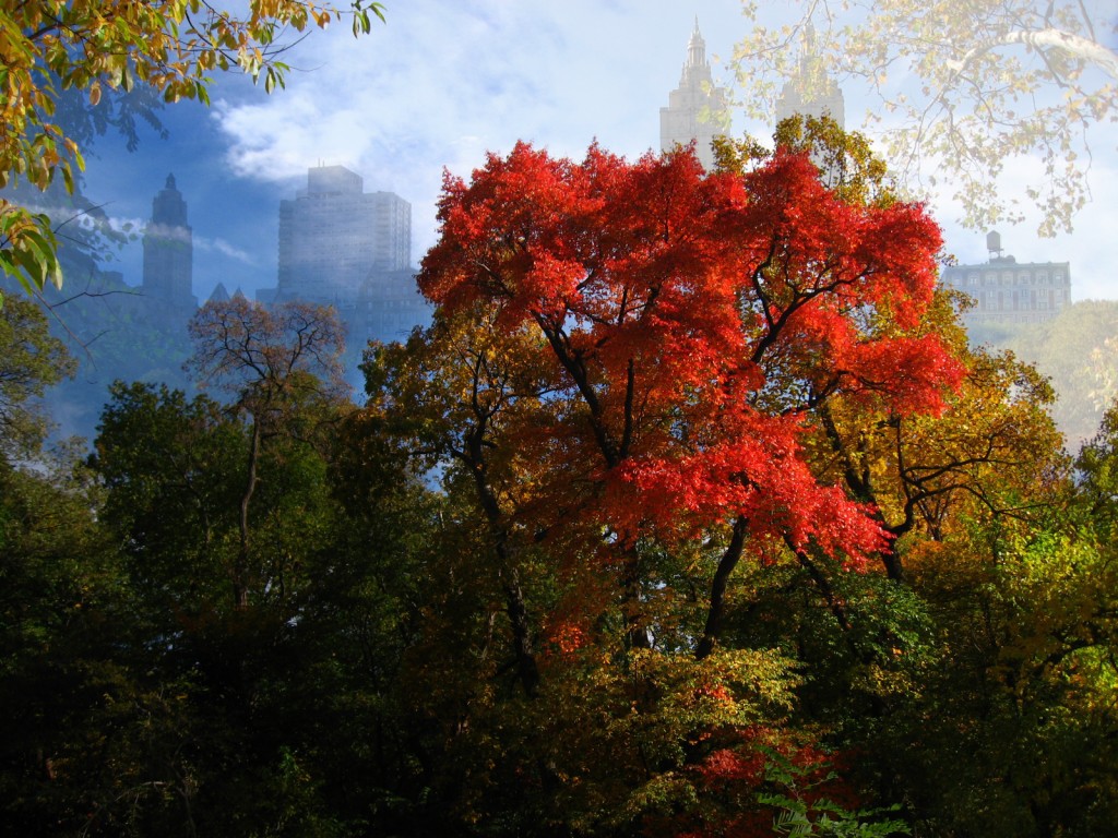
Red Tree super-imposed over the Central Park West cityscape

Did you ever wish you could make up your own landscape? Painters do it all the time. They might take some mountains from one place and a lake from somewhere else and paint them together to create their own Shangri-La. I used to paint — back when computers were practically non-existent and I was a budding artist at the High School of Music & Art in NYC in the early 70’s.  I painted landscapes in oil on canvas. I was ok, but not destined for greatness as a fine artist so I traded in my paint brushes for a career in graphic design. It’s a way to earn a living, while still being creative, but sometimes I still get the itch to create just for myself.

Now with a digital camera and Adobe PhotoShop CS4, I can once again use my imagination to create new landscapes (and seascapes for that matter) right on my computer. I can add my own touch to nature!

How do I do this? I use the layers palette  in PhotoShop CS4 to combine the two photographs that were used to make up the finished image above. Each photo gets its own layer. The photo with the red tree is on the base layer and the buildings on Central Park West are on a layer above. I then add a layer mask to “reveal all” to the buildings layer. Now, making sure that I have the layer mask selected on the layers palette, I use the paintbrush to brush away the parts of the buildings photo that I don’t want. I adjust the opacity of that layer to give the photo a more distant look and making the red tree layer pop more. By using layer masks instead of the eraser tool to get rid of unwanted parts of an image,  my original images are untouched so that if I need to go back and add parts back in I can. When I get the composition the way I want it, and after I have saved the PSD file, I then flatten the final image and save as a tiff, a png or jpg file and I am done.

The above image is available for purchase at my Dive Art & More gallery

Below are the two original images that I used:

Red Tree in Central Park- original photograph

Photograph of a red-leafed tree in autumn

Buildings along Central Park West

Central Park West with the Central Park Lake in the foreground